Scree Plot

Principal Component Analysis (PCA) is a linear dimensionality reduction technique that can be utilized for extracting information from a high-dimensional space by projecting it into a lower-dimensional sub-space. It tries to preserve the essential parts that have more variation of the data and remove the non-essential parts with fewer variation. Dimensions are nothing but features that represent the data.
According to Wikipedia, PCA is a statistical procedure that uses an orthogonal transformation to convert a set of observations of possibly correlated variables (entities each of which takes on various numerical values) into a set of values of linearly uncorrelated variables called principal components.
How does PCA work?
- Calculate a matrix that summarizes how our variables all relate to one another.
- Break this matrix down into two separate components: direction and magnitude. We can then understand the “directions” of our data and its “magnitude” (or how “important” each direction is).
The Principal Component matrix has the same dimensions as the original data matrix; however, many of the PCs may not be informative, so a reduction in the number of PCs is typically required. To do so, it is useful to examine the amount of variance explained by each new PC vector.
There are three common approaches in helping to make this decision:
- Eigenvalue criterion
- Proportion of variance explained criterion
- Scree plot criterion
Here in this blog we will explore Scree plot criterion-
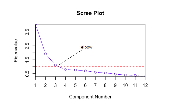
A common method for determining the number of PCs to be retained is a graphical representation known as a scree plot. A Scree Plot is a simple line segment plot that shows the eigenvalues for each individual PC. It shows the eigenvalues on the y-axis and the number of factors on the x-axis. It always displays a downward curve. Most scree plots look broadly similar in shape, starting high on the left, falling rather quickly, and then flattening out at some point. This is because the first component usually explains much of the variability, the next few components explain a moderate amount, and the latter components only explain a small fraction of the overall variability. The scree plot criterion looks for the “elbow” in the curve and selects all components just before the line flattens out. (In the PCA literature, the plot is called a ‘Scree’ Plot because it often looks like a ‘scree’ slope, where rocks have fallen down and accumulated on the side of a mountain.)

When the eigenvalues drop dramatically in size, an additional factor would add relatively little to the information already extracted.
Loading Data and visualizing scree plot
Let’s perform PCA on BFI (dataset based on personality assessment project), which were collected using a 6 point response scale: 1 Very Inaccurate, 2 Moderately Inaccurate, 3 Slightly Inaccurate 4 Slightly Accurate, 5 Moderately Accurate, and 6 Very Accurate. You can also download this dataset from the following the link: https://vincentarelbundock.github.io/Rdatasets/datasets.html

Here we apply PCA on BFI data and visualize using scree plot. We can see there are two factors (PC) having eigenvalues ≥ 1 and elbow point also at the same point. In above fig., just PC 1 and 2 are enough to describe the data.

To deal with a not-so-ideal scree plot curve, there are a couple ways:
- Kaiser rule: pick PCs with eigenvalues of at least 1.
- Proportion of variance plot: The selected PCs should be able to describe at least 80% of the variance.
If you end up with too many principal components (more than 3), PCA might not be the best way to visualize your data. Instead, consider other dimension reduction techniques, such as t-SNE and MDS etc.
This test is sometimes criticized for its subjectivity. Scree plots can have multiple “elbows” that make it difficult to know the correct number of factors or components to retain, making the test unreliable. There is also no standard for the scaling of the x and y axes, which means that different statistical programs can produce different plots from the same data. A more objective version of the scree test has been proposed called the Cattell–Nelson–Gorsuch scree test (CNG scree test).
